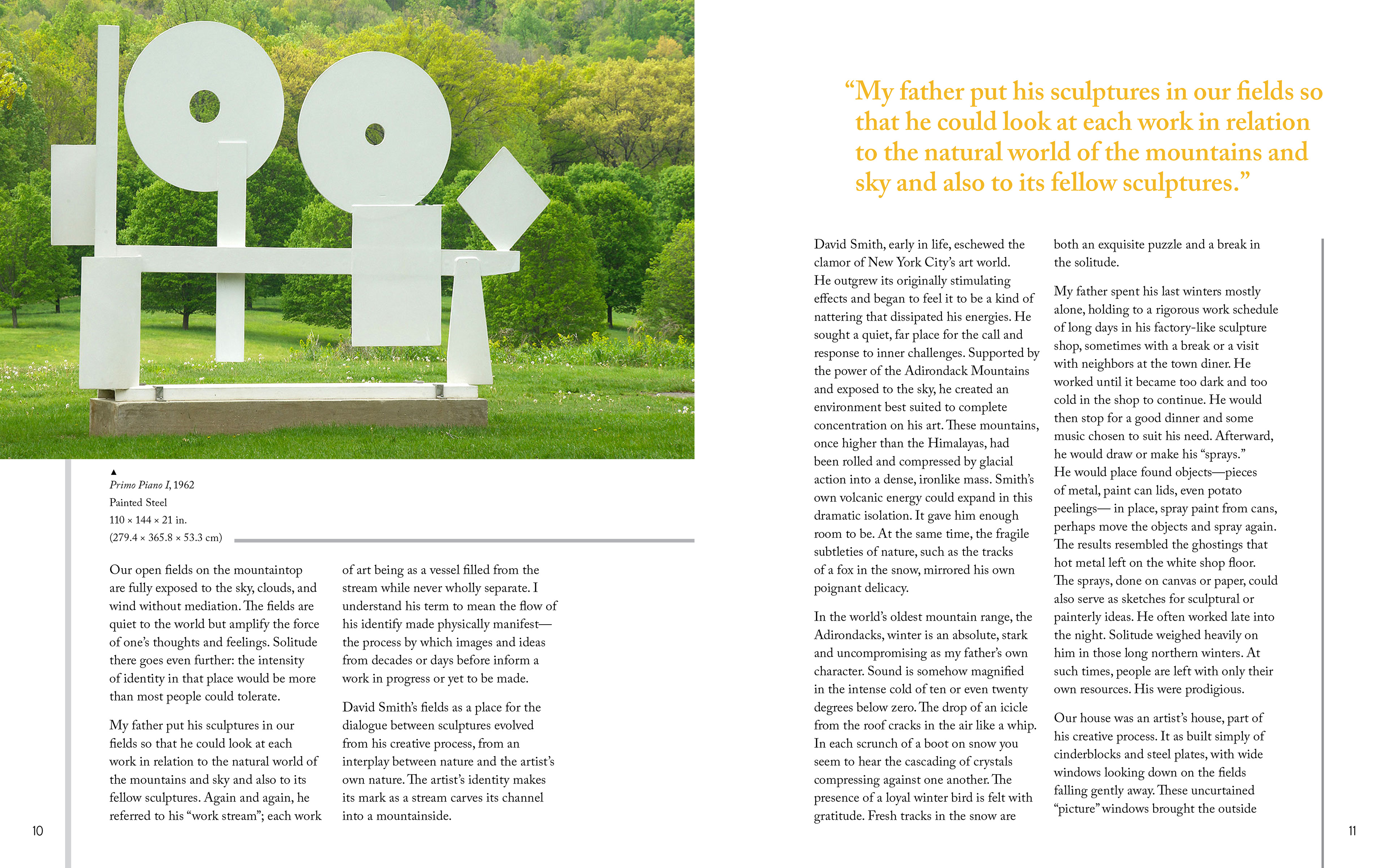
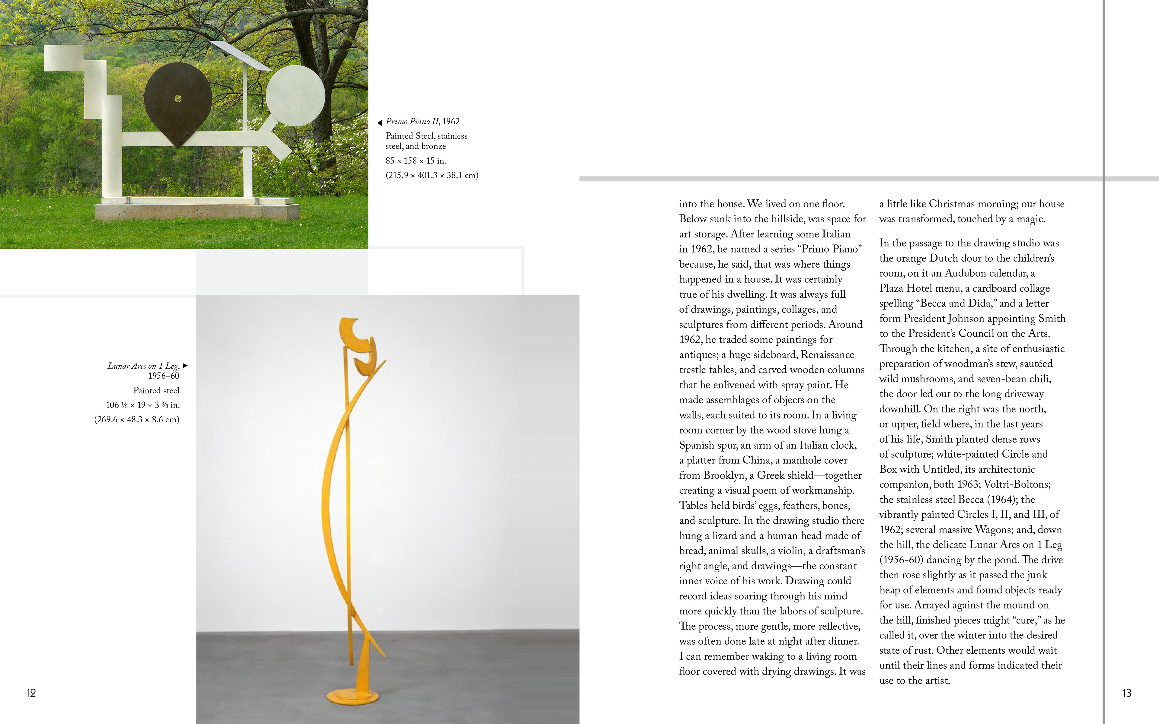
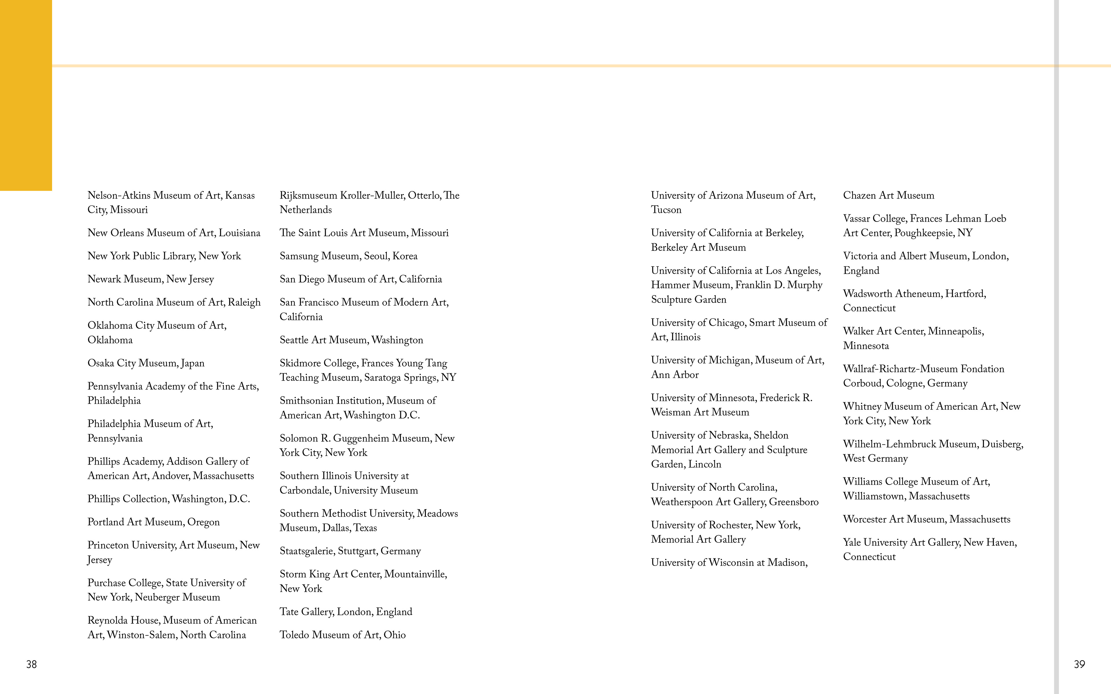
This project challenged me to design the cover and several representative spreads for a high-quality art book profiling the work of sculptor David Smith through observation and practice, further develop understanding of typographic systems, grid usage and page composition across a multi-page document. It let me learn how to organize, understand, interpret and graphically translate content (information/messaging/meaning) in a logical, unified and visually expressive way.
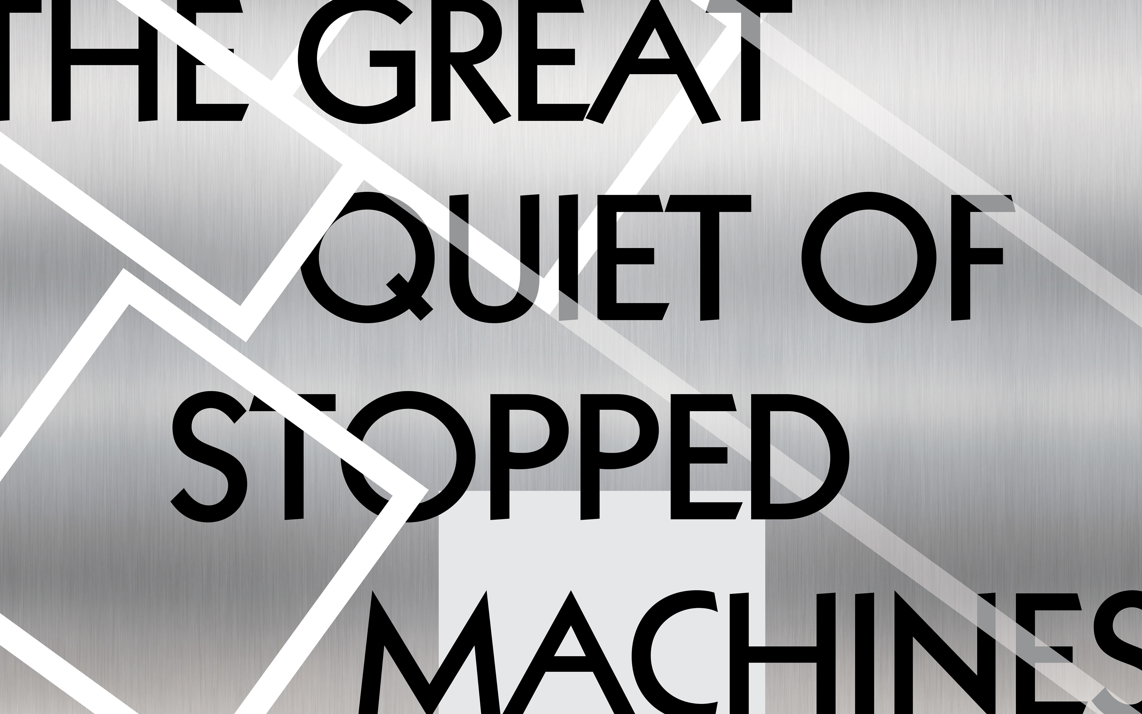
Each element—from color to typeface—in the overall design is mostly inspired from Smith’s Cubi series. The monochromatic color scheme clearly shows that it is derived from his Cubi series, while the yellow color is from other works. The geometric shapes in the title and subtitle pages are an abstract version of Smith’s Cubi XI, and the interaction of overlapping between each other reminds the viewers of Cubi series’ arbitrary compositions, although it was an accidental effect when working on the screen. The reason why Kabel is chosen for the main typeface is that not just it is a geometric sans-serif, but also the angle of its stroke reflects arbitrariness of the compositions in some of his Cubi series.


