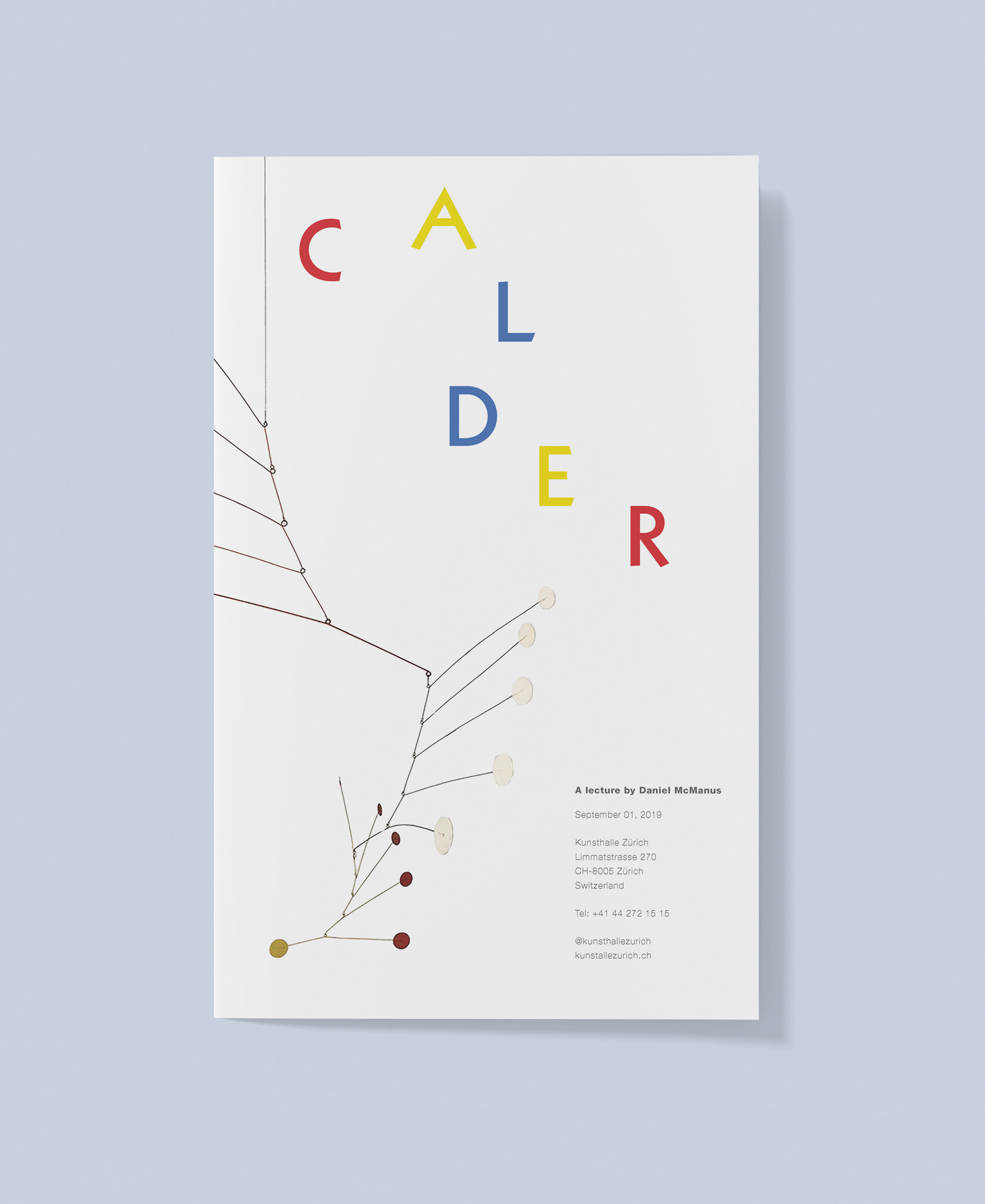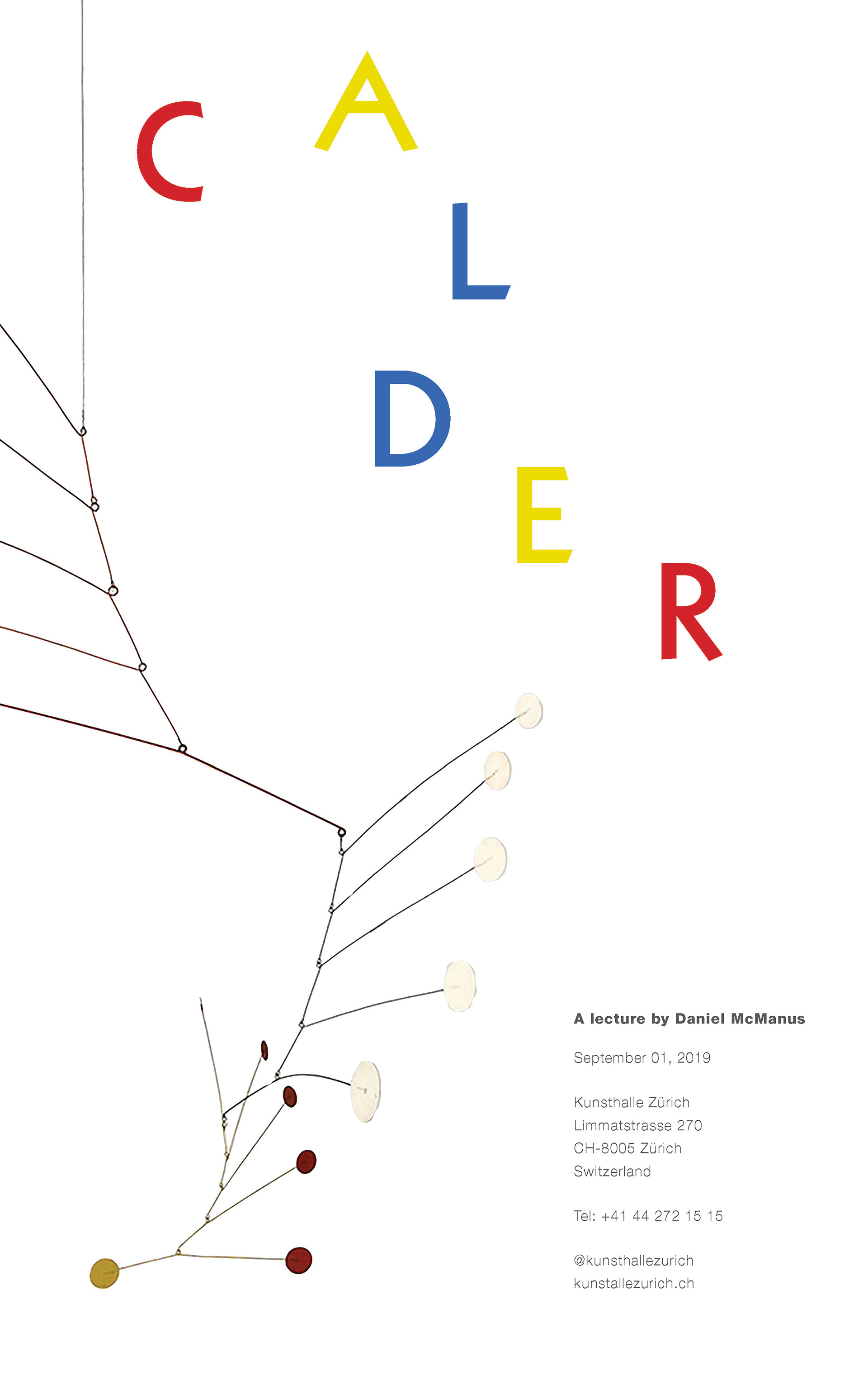
This work was done in the project called Type and Image. The purpose of the project is to explore the relationships between type and image by designing an informative and visually compelling poster announcing a lecture about an artist and their work.
I explored the composition in general, and the one of the letters of the artist's last name, which is associated with the shape of his work shown in the image, at the same time. I chose a geometric sans-serif typeface, Kabel, with the primary colors for the artist's last name, because it reflects the shape and the kinetic movements of his works, also because most of his works are colored with the primary colors. The typeface of the information is Helvetica, and the reason why I chose it is that I did not longer give a sense of movement but stillness so that the description can be distinct from other elements.